Innate Package Design

Innate Personal Care Line
Concept Creation, Packaging Design.
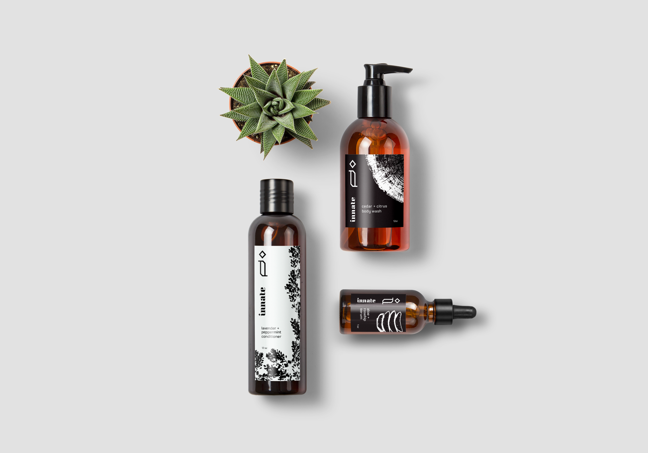
The packaging for the Innate line of products was made with essential qualities in mind, much like the ingredients found within. Sticking to recognizable, simple bottles with clean shapes does not allude to anything extremely luxurious or complex. It is a brand purposefully focused on high quality, basic, natural and affordable products.


Using an angular type style for the brand mark and logotype adds contrast between the product shapes. The clean lines of the typeface also fall in line with the no frills, essential idea which the brand is based upon. The black and white color palette follows the same idea. The reversed shapes of tree rings, aloe and other plant art pieces correlate to the main ingredients in each product and give each their own look under the visual system.


